Introduction: Product Overview and Problem statement
Liase is a mobile application for purchasing premium and luxury fashion and accessories. The name is a play on the French word "liaise," meaning to connect or unite. This concept of connection ultimately proved to be far more central to the product than I initially anticipated, but more on that later.

This is a conceptual project completed independently as part of the Product Designer & UX Researcher course, spanning branding, user research, information architecture, visual design system, and interactive prototyping.
At the core of the user journey is the product search and selection flow. This is the pivotal touchpoint where a user transitions from initial interest to purchase intent, and where the most friction occurs: they struggle to gauge fit, lack sufficient visual assets, don't know how to style the item, and fail to seamlessly transition from visual inspiration to the relevant SKU in the catalog.
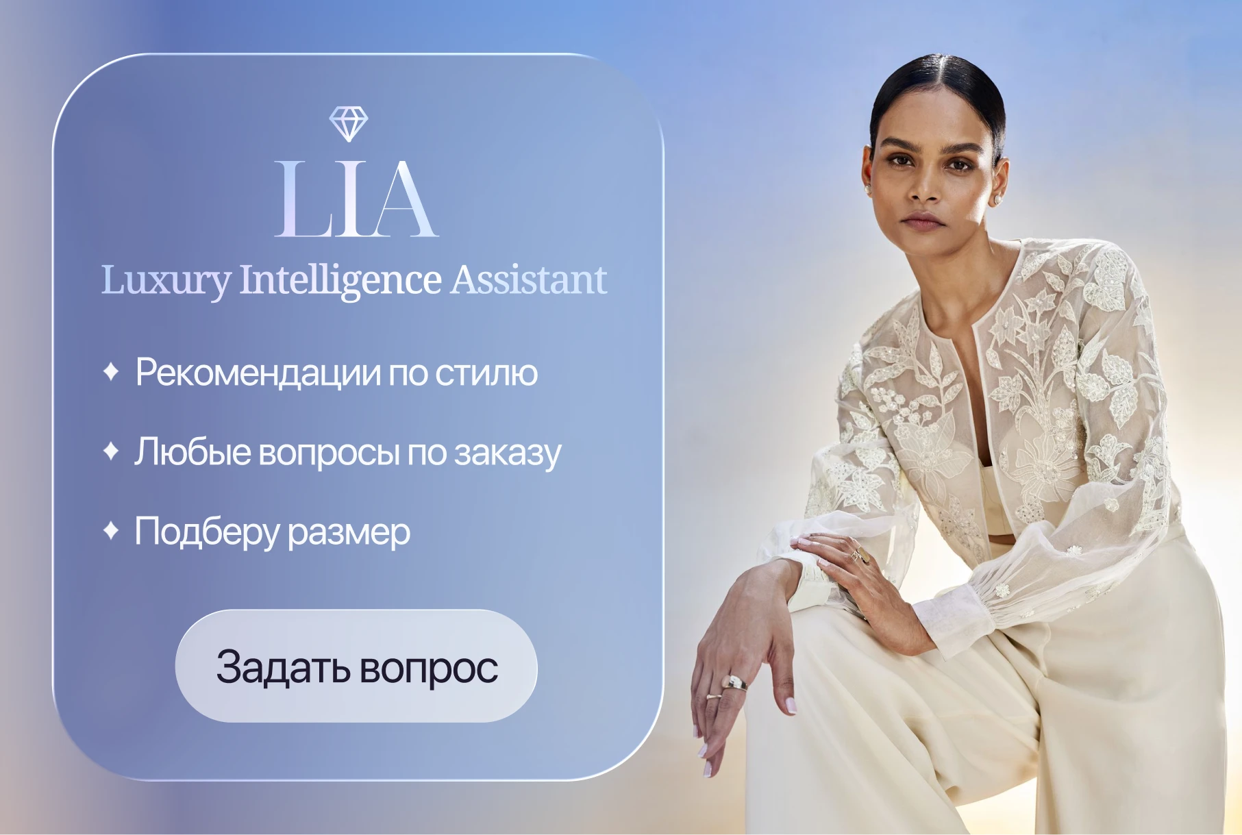
The core of the product is LIA (Luxury Intelligence Assistant), whose name is literally embedded within the Liase brand. By design, LIA was intended to be a primary entry point on par with search and directory browsing—serving as the key tool to help users overcome friction points in the decision-making user journey. From this, two operational objectives emerge: to increase conversion rates and to drive deeper user engagement with LIA.
Phase 1: Why AI is a market-wide bet, not just a feature
Before designing LIA, I had to address a key question: does the assistant tangibly drive conversion, or is it merely a passing trend?
I conducted desk research and analyzed 5 of the most representative AI-driven products in the market: Zalando, Net-a-Porter, Mytheresa, DressX Agent, and Alibaba AI. They all share a single direction: AI is transitioning from an auxiliary feature into the primary interface.
Alibaba promoted its AI assistant to a dedicated navigation tab alongside the catalog, resulting in a 149% increase in MAU. Myntra recorded a threefold increase in conversion rates among users who interacted with their assistant; its AI-powered stylist became the most utilized feature on the home screen, capturing a 65% CTR immediately post-launch. Farfetch showed a 28% increase in average order value (AOV). Net-a-Porter is currently building a hybrid AI and human stylist model for VIP clients.
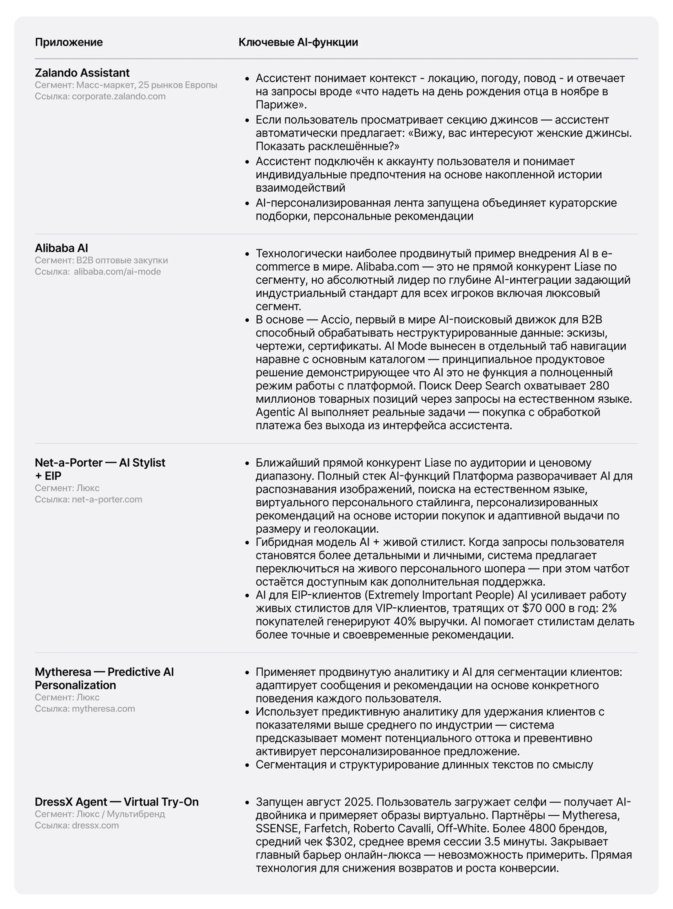
The underlying mechanism is identical across the board: a user who engages with the assistant shows higher conversion rates and a larger average order value. At the moment of friction, the assistant drives the purchasing decision more effectively than any filter or sorting option.
Phase 2: User flow of the "Product Selection and Search" scenario and the initial structure
Next, I conducted a competitive analysis across a broad spectrum of platforms, ranging from mass-market fashion marketplaces to niche luxury sites. My evaluation went beyond visual design to analyze UX navigation logic, product detail page (PDP) layouts, filtering systems, and user service flows, with a specific focus on identifying established industry design patterns.
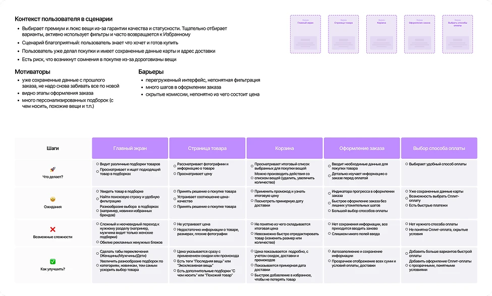
To map the UJM (User Journey Map), I conducted 6 in-depth interviews with women aged 30–40 who frequently shop for clothing online. This group included both regular premium and luxury segment buyers, as well as those who engaged with this segment occasionally—for instance, making a one-off purchase at a vintage store. This mix provided a valuable contrast, helping me identify which barriers are universal to e-commerce as a whole, and which are specific to the luxury niche—such as authenticity concerns, uncertainty about fit without a try-on, or the feeling that the brand is "not for me."
Combined with competitive analysis, this produced a map that visualizes the user journey not just as a sequence of steps, but as an emotional experience: marking points of interest, moments of hesitation, and drop-off stages.
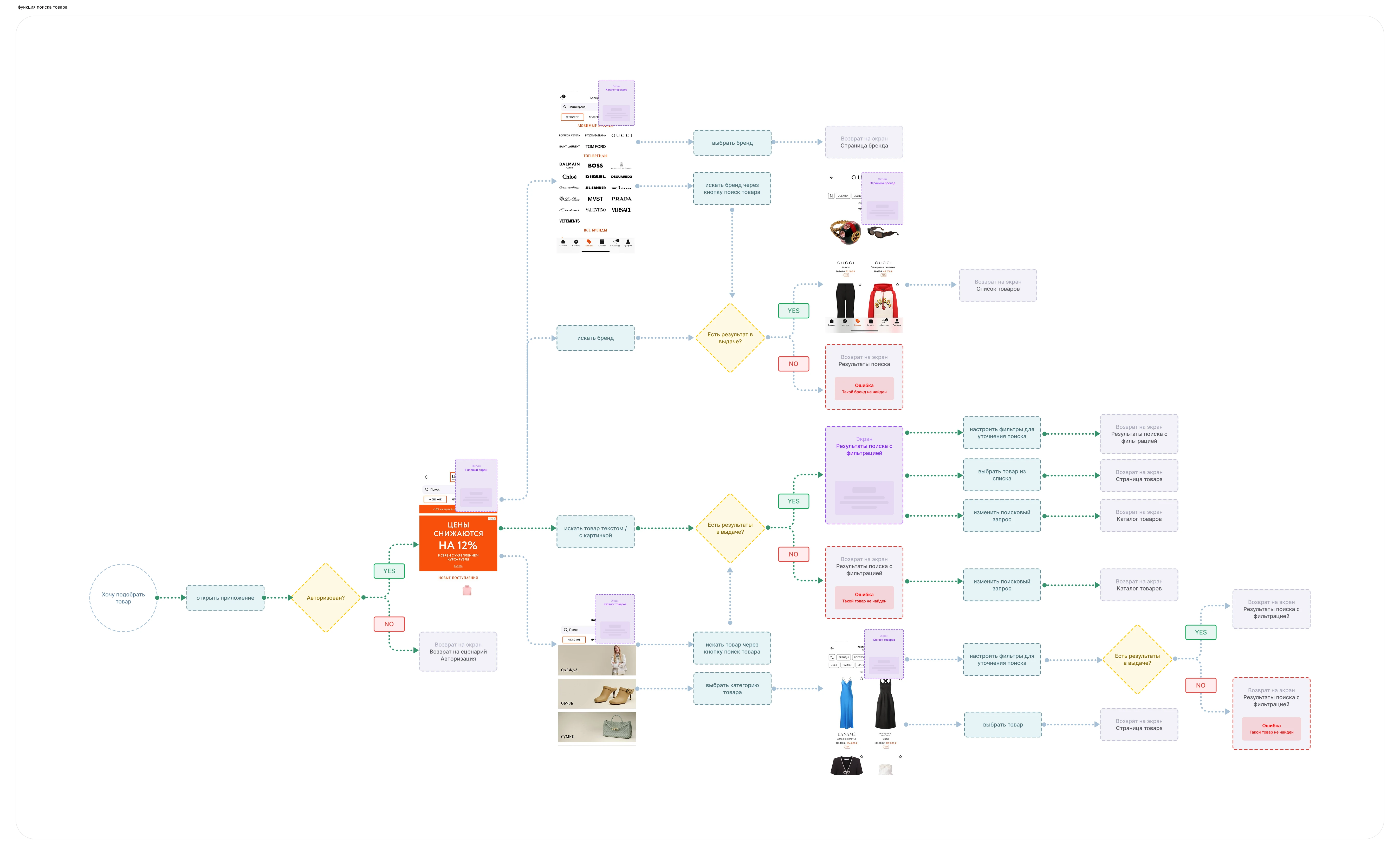
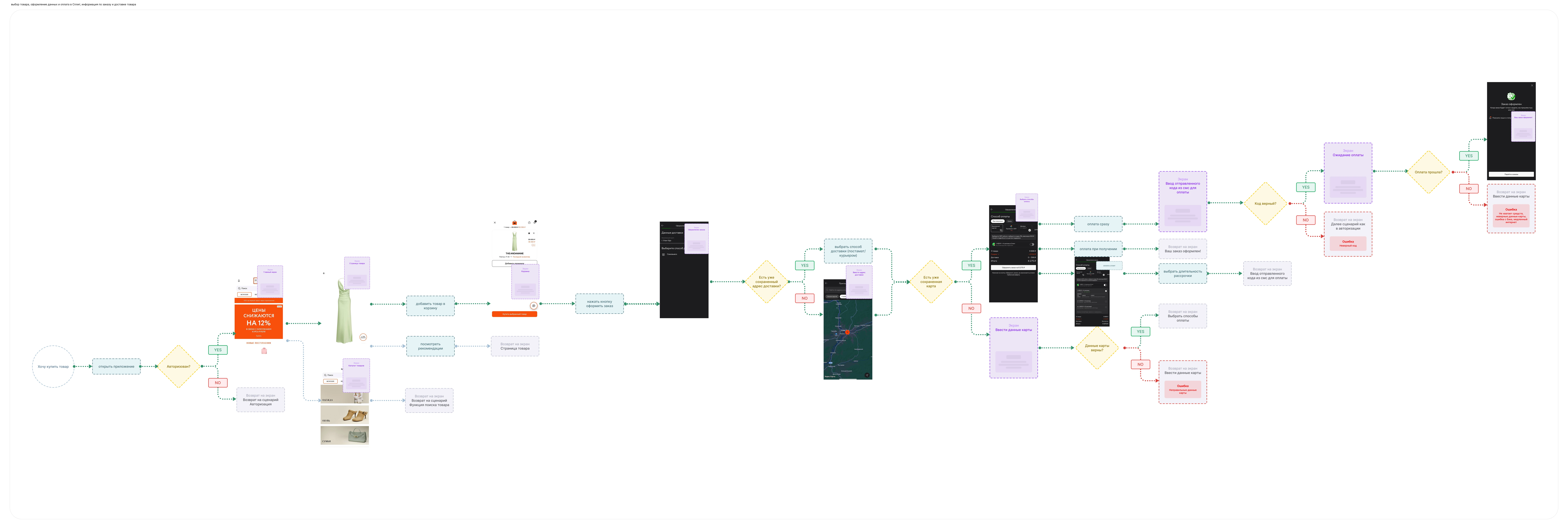
The next step was to map the primary scenario functionally, step-by-step, to pinpoint exactly where friction occurs. Consequently, I defined the User Flow for the "Product Search and Selection" scenario, charting the path from the initial app launch to adding an item to the cart.
Phase 3: Visual Concept and Prototype
The key objective: to strike a balance between three distinct layers:
Premium aesthetic — clean, white minimalism. The background does not compete with the product. The user focuses on the item, not the interface.
High-tech feel — gradients and holographic effects. These establish a sense of modernity and differentiate the product from traditional luxury platforms.
Innovation — transparent trending element styling in glassmorphism. These add depth and lightness without cluttering the screen or UI.
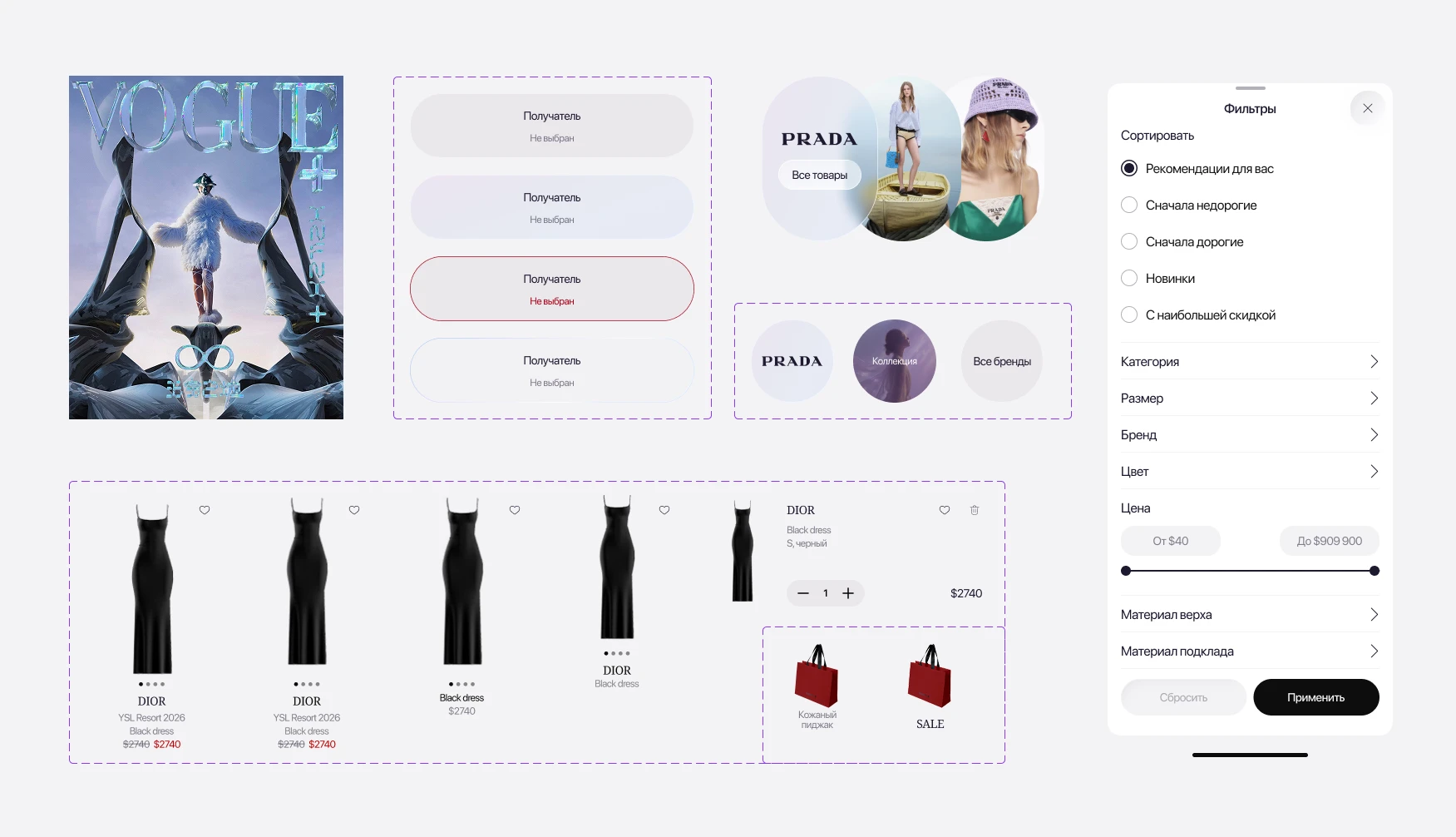
These three principles are not mere aesthetics—they resonate with the target audience: while the luxury buyer expects restraint, Liase adds a high-tech layer that translates as "something different is happening here."
LIA is visually distinct from everything else: its navigation bar icon is highlighted with a holographic accent—it draws the eye and signals that this is no ordinary section.
Phase 4: Product Search and Selection User Scenario
This stage represented the highest-friction point in the customer journey. It is where initial interest turns into purchase intent—and where the research revealed the greatest concentration of usability issues.
Although users had already found a product, many were still hesitant to buy. Common friction points included uncertainty about product authenticity, difficulty assessing fit, insufficient product imagery, and a lack of styling inspiration. Each of these issues negatively impacted conversion.
Based on the research findings, I formulated the following hypotheses for improving product discovery and the purchase journey:
If model faces are cropped from product images, users will focus on the garment rather than the model, following a common pattern used by luxury retailers such as Mytheresa and TSUM.
If swipeable image carousels are available directly on the Product Listing Page (PLP), users can evaluate multiple product views without opening the Product Detail Page (PDP), reducing interaction costs and increasing engagement.
If Local Inventory Ads (LIA) become a first-class entry point, users will better recognize in-store availability as a key product differentiator, supporting both retention and conversion.
If "Shop the Look" and "Similar Products" modules are added to the PDP, users will discover styling ideas and relevant alternatives without interrupting their shopping flow, reducing bounce rates and decision fatigue.
If collections are linked from the PDP via clickable tags, users can seamlessly explore related products without leaving their current journey, increasing products viewed per session.
If back-in-stock notifications are available for specific sizes, users will return when their preferred size becomes available, helping recover otherwise lost purchase intent.
If promo codes are applied automatically and gift cards are easily accessible within the cart, users will no longer leave checkout to search for coupon fields, reducing cart abandonment.
If visual search is integrated, users can move directly from inspiration to a relevant product, shortening the discovery journey and reducing abandoned sessions.
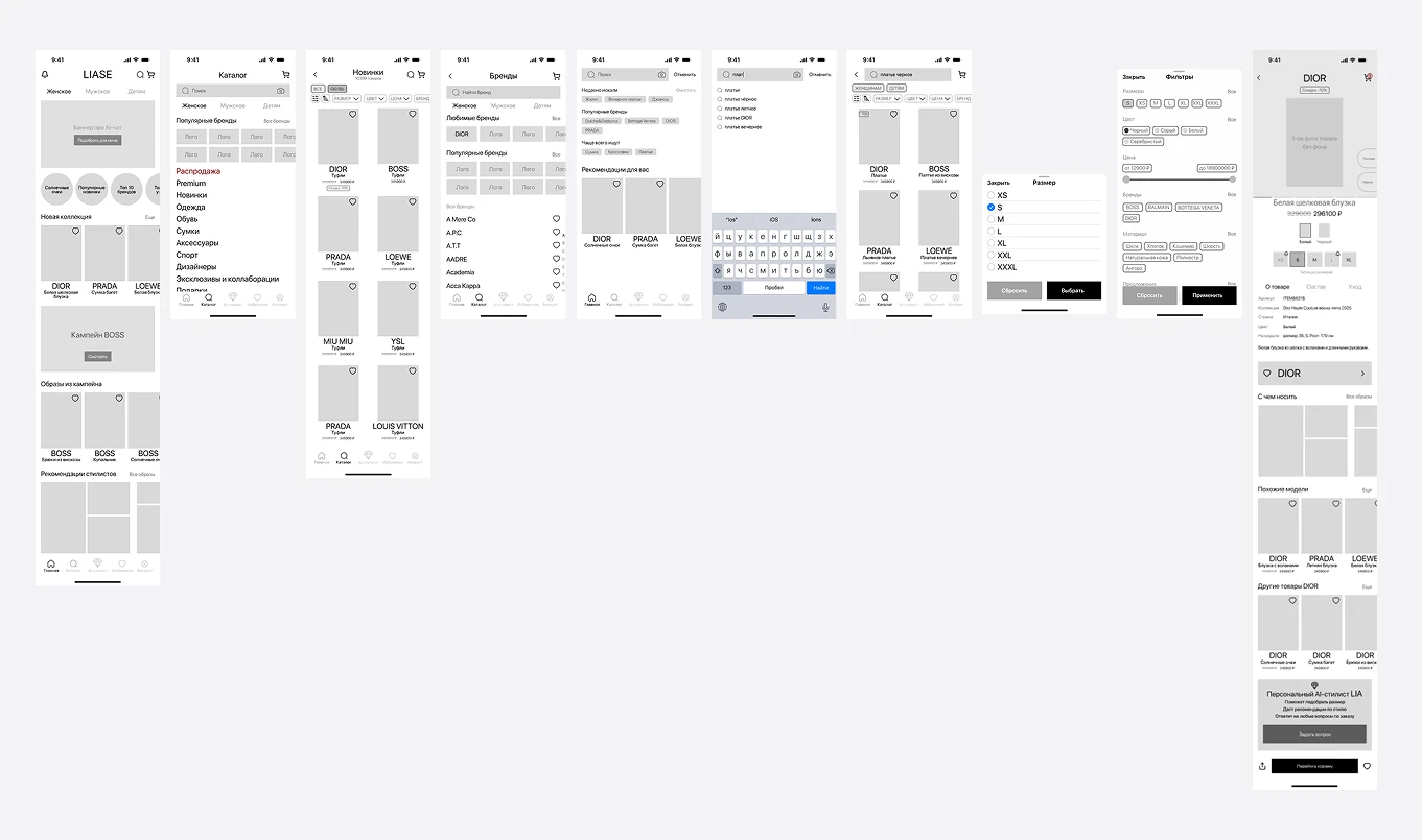
These hypotheses formed the foundation for the initial structure. Lo-fi prototypes established the layout for key screens, focusing solely on user logic and architecture.
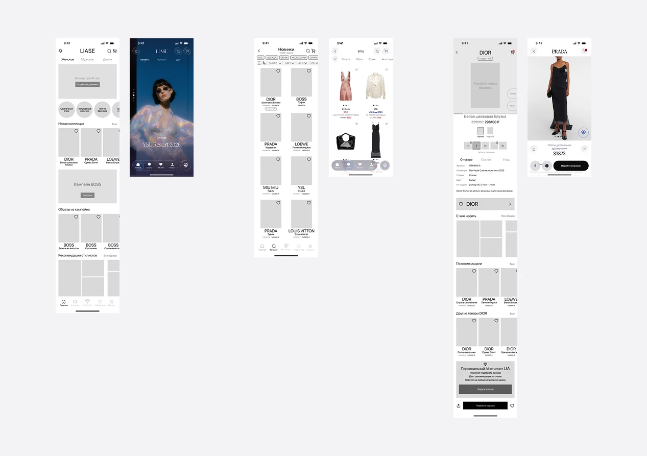
As the design progressed, the screens evolved:
Home Page — Enhanced visuals based on competitive analysis: ads and banners now span full-screen, with vertical scroll/swipe interaction.
Product Listing and Filter/Sort Logic Redesign — Sorting has been integrated into the filters based on competitive analysis; filter levels are displayed automatically to improve user experience (UX).
Product Detail Page (PDP) — Color and size selectors are positioned adjacent to the primary Call to Action (CTA); Looks and Related Items have been moved to the AI assistant button.

Link to the 'Product Search & Selection' user flow
Open file in Figma
Phase 5: My initial hypothesis — and the usability test that resolved everything
Based on user interviews, I formulated the following hypotheses: photo search will shorten the user flow from inspiration to product; curated looks and the 'style with' section will reduce friction on the product detail page (PDP); and model sizing parameters will eliminate uncertainty regarding fit. Our primary hypothesis is that over 55% of users will opt for search, and the Luxury Intelligence Assistant (LIA) feature highly visible and sought after as the primary entry point. This was validated by market data and interest in LIAs during user interviews.
For validation, I conducted two tests: a qualitative usability test using a prototype, and a quantitative first-click analysis.
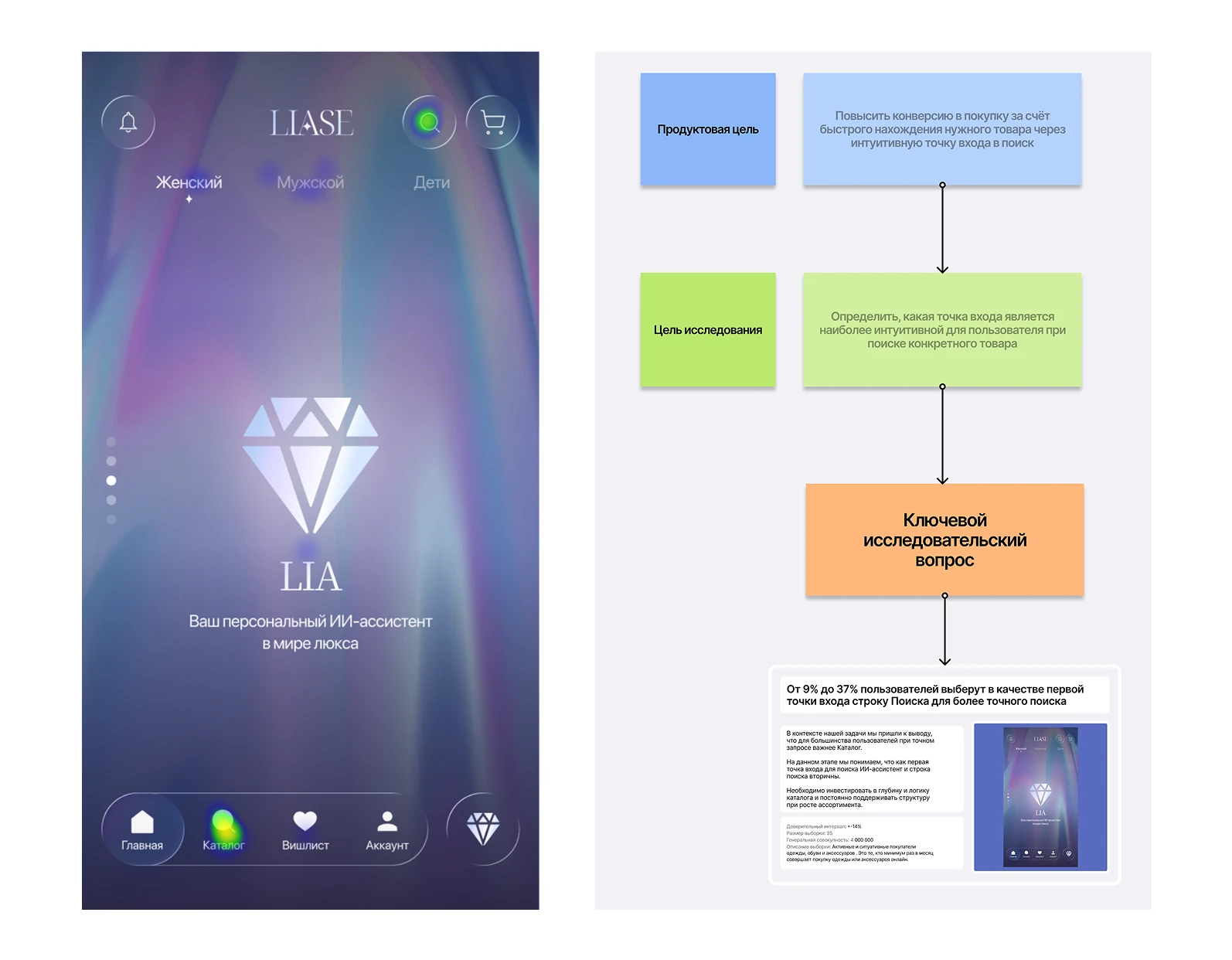
I conducted the first-click testing on the Pathway platform, and the majority of users ultimately clicked on the catalog. Not on search, not on LIA. They clicked on the catalog intuitively, without hesitation.
I conducted qualitative testing with 2 respondents using in-depth interviews and UX testing. Post-interview analysis revealed a critical insight: while the LIA (Local Inventory Ad) sparked interest, its clarity was non-existent—users wanted to click on it but had no idea what the outcome would be. Meanwhile, during the interviews, both user personas could easily envision its use cases: confirming sizing, styling an outfit, or learning about the brand.
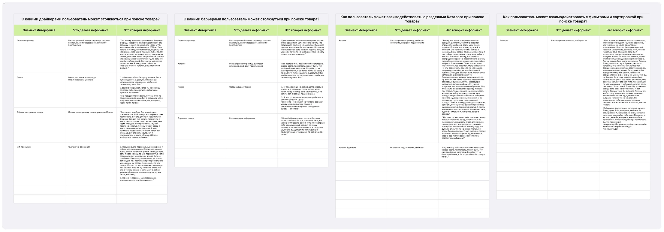
The issue was not the relevance of the LIA (Lead-In Assistant), but rather its timing. Users do not seek out an assistant at the start of their journey. They navigate toward a specific item, and that is precisely where—during the moment of hesitation on the product detail page (PDP)—the assistant becomes essential.
Phase 6: UI changes and product integration of LIA into the user journey
The catalog structure was redesigned by eliminating redundant layers of nesting and introducing subcategories organized by use case and structural attributes. This allows active users to navigate to their target destination without cognitive overload, while circumstantial shoppers can locate what they need with minimal friction.
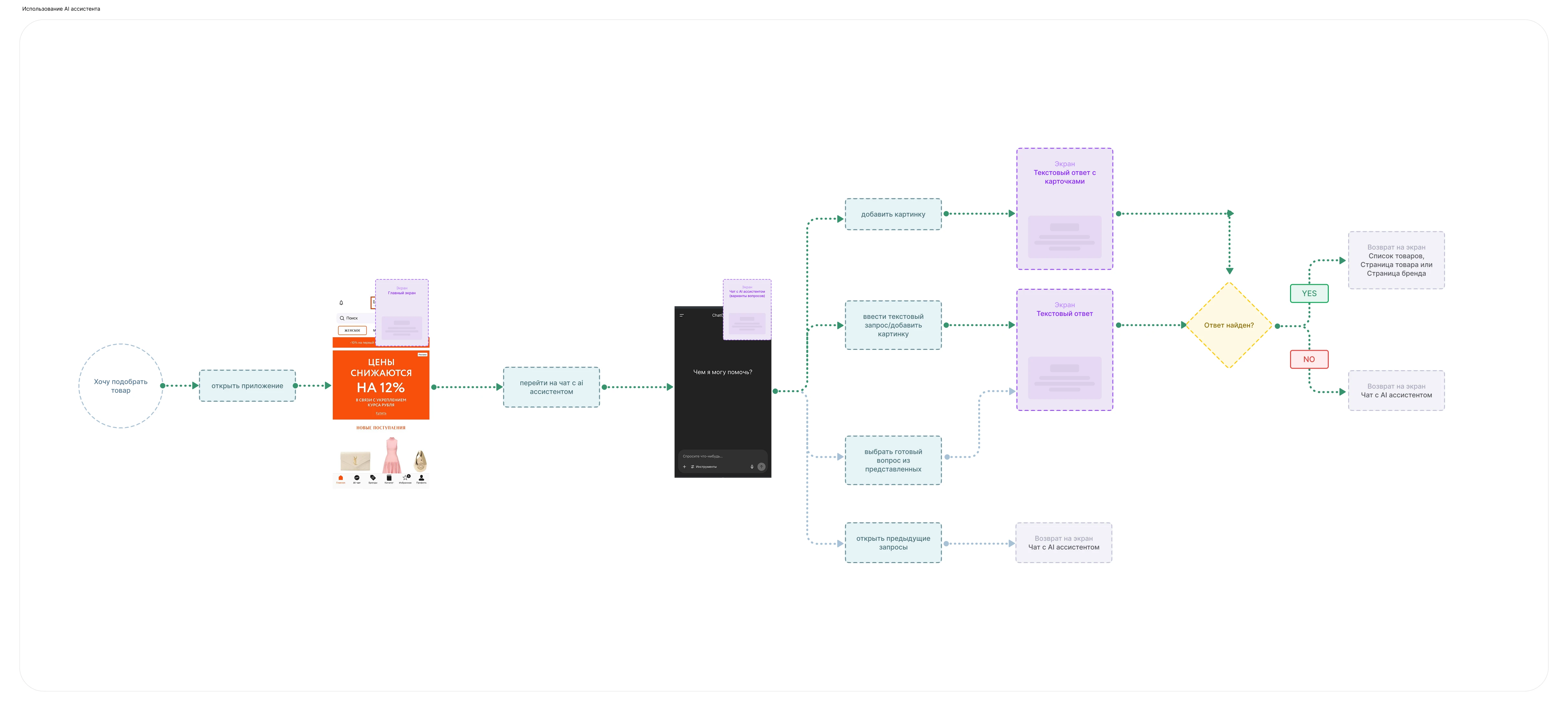
LIA functions as an overlay on top of the user flow. The LIA icon in the navigation bar remains persistently visible, accessible with a single tap from any screen. This is not meant as a primary call to action, but rather as a visual indicator that the tool is readily available whenever needed.
Link to the "AI Assistant" user scenario
Open file in Figma
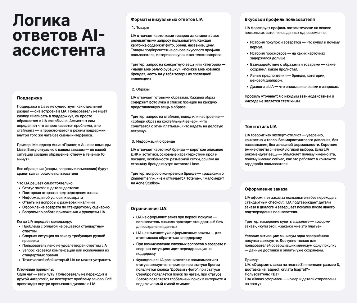
LIA appears on the product card triggered by a specific friction point: 'Find an outfit for an occasion,' 'Learn about this brand,' or 'Check the fit.' The assistant doesn't wait for a user query—it is triggered when the user hesitates: such as spending 30 seconds on a product card, having an item in their wishlist without adding it to the cart, or leaving an open cart without checking out. Outfits and individual products are LIA's primary response format: the assistant is designed to respond with a curated look or a specific product that the user can save or proceed to purchase.
On the home screen, LIA welcomes users with context-aware, ready-made scenarios: for mornings, before weekends, or tailored for new and returning users. While an empty input field creates friction, a pre-defined prompt successfully initiates the user dialogue.
Features postponed but not rejected:
AI Avatar using user photos — postponed, not rejected. Evaluated as a feature to showcase the product "on the user," which directly impacts the quality of search and selection. Dropped from the MVP due to technical complexity at the initial stage. This is not a fundamental rejection of the concept, but rather a matter of prioritization.
AI + Human Stylist hybrid model — postponed, not rejected. Evaluated as an alternative to purely algorithmic search and recommendations. Dropped from the MVP for the same reason: implementation complexity and operational overhead (recruiting stylists, building workflows).
Conclusion: Reflection and Growth
When I returned to the name Liase—which translates to "bind" or "connect"—I realized it describes the product much more accurately than I had initially envisioned. A connection is not established instantly. LIA does not fully reveal itself at the first touchpoint: it learns from user actions, the visual assets they save, and the dwell time they spend on a card. The user adapts to the product, and the product adapts to the user.
I began the project believing that LIA was merely a feature. By the end, I understood that LIA is a relationship — it simply starts delivering value not from the initial click, but during subsequent visits.
This project taught me to think like a product designer: not just screen-to-screen, but from user intent—across the entire user journey—to a solution validated by data.
Link to the complete "LIASE" project
Open file in Figma

Link to Behance case study
View case study